Monday, 29 October 2007
Philosophy behind the design: the blue in it represents the sky and also the traditional color of Bavaria, the white color represents the blades of an airplane. The alternaitng colors show the airplane propeller spinning through the sky.
"The BMW logo design represents strength, durability and style."

Philosophy behind the design: The idea was introduced by Dick and Mac McDonald as arch shaped signs on the sides of their then ‘walk-up hamburger stand’ looked like the letter “M” from an angle and thus, were incorporated in the McDonalds logo as a merger of the two golden arches together. Therefore, the Golden Arch was formed.

Philosophy behind the design: As there were a large number of bats living under the roof of the distillery, it was decided that it was appropriate to also show the bats on the brand of its white Bacardi Rum products. Fruit bats are considered a symbol of good luck in Cuba.
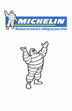
Philosophy behind the design: The concept of the tire man was an inspiration of Edourd when he saw a pile of stacked tires which looked like the shape of a human. In line with the changes in the industry where tires have changed and evolved over time, so too are the tires of varying sizes on the tire man.

Philosophy behind the design: Some years back, Micheal Parent, a student of marketing management and a graphic designer, noticed that females felt uncomfortable while holding and being around Starbucks items. This intrigued him to conduct a study.
Micheal surveyed different locations of Starbuck’s outlets and spent time there, sometimes conducting interviews and rest of the time carefully observing the customer behavior pattern. Conclusions that were drawn from his survey were that the Starbucks logo needed an improvement.
♥ the world will turn CRAPPY.
16:09